Monday, January 12, 2015

Post #13

How can you as the designer use principles of design to help compose a page?
Utilizing principles and elements of design.

What are the principles of design (define each in your own words)?
1) Repetition - a repeated design

2) Alignment - the placement of a design 
3) Proximity - distance of objects that are manipulated
4) Contrast - the light and darks of an object

For each of the 4 principles of C.R.A.P., find an example that utilizes the principle 
within the design. You should have 4 DIFFERENT sample designs. For each, discuss how the particular principle is used.
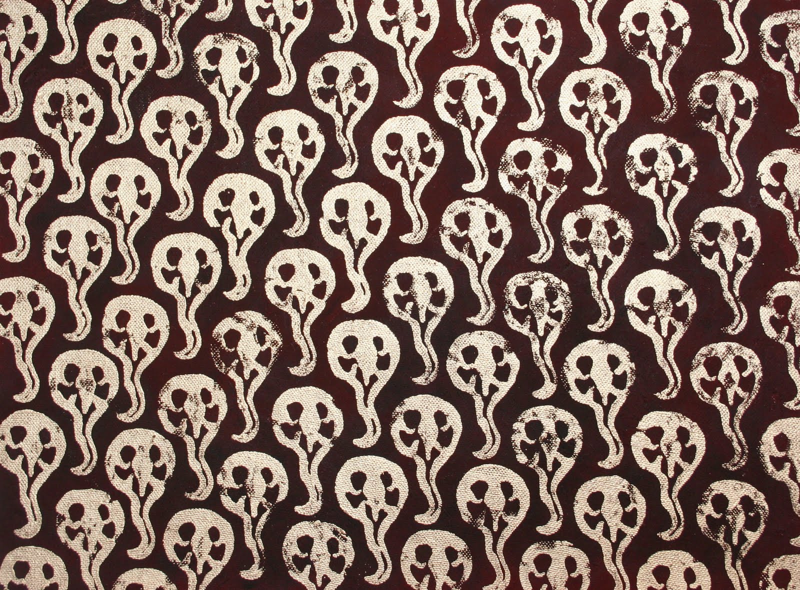
This uses repetition by repeating that design over and over.  Only difference is the opacity for each design. 

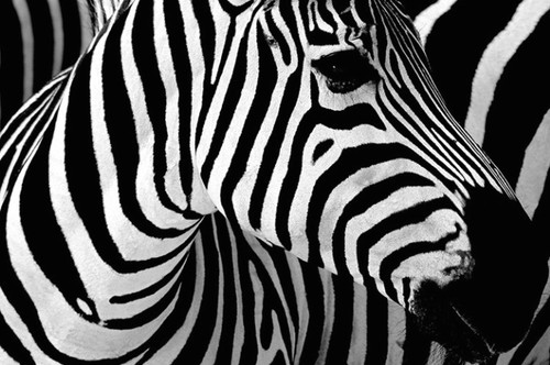
 Zebras are perfect examples of contrast.  The black and white are the contrasting colors that make the image stand out. 
The iconic logo of Adidas would not be the same without its proximity.  The proximity gives it an almost triangle like look. 
When something is aligned, it looks more in place rather than out of place.  


Also, answer the following questions in your own words.
How do you add a layer mask to a particular layer?

Select the desired layer then click 'add layer mask'.  You will be able to reveal or hide the layer under.

What two colors are used to create the mask?
Black and white. 

Describe the process of using a layer mask?
It changes the transparency. 
Post #12

Define principles of design?
Guidelines applied to the elements of design.

What do the principles of design affect?
The way the elements of design appear in a piece.

What is the difference between the principles of design and C.R.A.P.? How can contrast help a design? 
The concepts of balance, proportions, rhythm, emphasis, and unity are principles of design. C.R.A.P. is contrast, repetition, alignment, and proximity.  Contrast helps a design to emphasize a part of a design.

What is wrong with having too much or too little contrast in a design?
Too much contrast is confusing.  Too little contrast is dull.


What is the key to working with contrast?

There needs to be balance.

What are some common ways of creating contrast?

Different colors, or utilizing positive and negative space. 

What is the principle of repetition?

Something that repeats itself.

Describe ways that the principle of repetition helps the composition?

It can act as a background.

What are ways that you can incorporate repetition into your designs?  

Reuse shapes and colors.

What should you avoid when working with repetition? 
Excessive repetition.

What is the principle of alignment?  
Placing things in a good place so it is balanced and fitting. 


What is the principle of proximity?  
Varying distance. 


What is the principle of proportion?
How things relate to each other in size.

Define symmetrical balance?
Both sides are equal in color and everything else.

What is another name for asymmetrical balance? 
Informal balance.

Define asymmetrical balance?  
One side is too heavy or light compared to the other.


What is a focal point and how is it created?
A focal point is a design that acquires most audience's focus which is created by using multiple principles or elements. 


How many components of a composition can be a focal point?
About 3.


What ways can emphasis be created in a design?
Contrast, colors, and balance.


What is the principle of harmony and how is it different from unity?

It's when multiple objects, almost identical, are used in a design that unities it in look whereas unity is when the designs are actually joined. 

What is the principle of unity? What three ways can unity be obtained?
Elements and objects used in a design to make something look unified.  It can be achieved by the use of contrast, balance, and colors.

What is the principle of variety?

Various elements and principles used to become more appealing.

What three ways can a designer add variety to a design?
Contrasting color, size and directions in a design.


Post #11

Who is Andy Warhol?
One of the most famous artists of his time. 

Within what art genre did Warhol work?

Pop art. 

Define the genre?

It implements popular culture of a specific time period.

During what years was he alive?

1928-1887.

Post 2 samples of his art. Answer the following questions for each piece.


Title of the piece?

Marilyn Diptych 
Describe the color that he utilizes.  Does he use any particular color scheme?

He uses colors that are almost complementary like the orange and the blue. 
What do you notice about the artwork itself?

It reminds of inverted colored paintings.


Title of the piece?
Campbell's Soup Cans.

Describe the color that he utilizes.  Does he use any particular color scheme?
He uses red, white and gold.  

What do you notice about the artwork itself?
It is very repetitive.  It is also extremely popular.  Everybody can recognize it.

Wednesday, November 26, 2014

Post #10

Compare and contrast vector graphics and pixel images. 
Vector graphics can stay clear when chaining the size of the image whereas pixel images become blurry. 

What resolution is necessary to print raster images?
The minimum is 300 ppi.

What resolution is necessary to display raster images on the internet?
The minimum is 72 ppi.

Post #9

Who is Steve Jobs?

The co-founder and later CEO of Apple.

What company was he CEO for many years?
Apple. 

What did he do for the computer industry?

He gave computers a personal feel instead of just a business kind of thing. 

How did this man impact the graphic design industry?

He created new programs that allowed designers to be able to draw on the computer.  

Post #8

Why must designers pay close attention to how color is utilized within a composition?
Using the wrong colors can give a different vibe or impression than what was intended.

Why is the color wheel an important tool for graphic designers?
It shows color relations which makes it easier for graphic designers to choose from.

Find an example of neutral colors utilized within a design (hint: google poster design). 

Near the sample, discuss why you feel the designer included neutral colors within the 
composition.
It gives it a sophisticated look.

Briefly describe how we "see" the color of an object?
The receptors in our eyes allow us to see the color of an object. 


Post #7

Describe white light? 
White light composed of all colors of light.

How do we see color if objects "have no color of their own"? 
When that color is reflected by an object but absorbs all other colors. 

What seven colors result when white light is refracted through a prism?

 Red, orange, yellow, green, blue, indigo, and purple.

Describe hue? 

The purest form of a color.

What happens with white? 
It becomes prevalent when an object reflects off all the other colors of light. 

What happens with black?

It becomes prevalent when an object absorbs all the other colors of light. 

How color is perceived depends on what?

It is based on which light an object reflects or absorbs. 

What is a color wheel? 

A diagram that shows the colors in sections and their relationship to the colors next to them. 

What are primary colors? Name them? 

Colors (red, blue, yellow) that cannot be made by mixing other colors.

What are secondary colors? Name them? 

Colors (green, purple, and yellow) made by mixing primary colors.

What are tertiary colors? Name them? 

Colors (red-violet, yellow-green, green-blue, etc.) made by mixing primary and/or secondary colors. 

What are neutral colors? How can they be created? 

Colors (black, white, grey, brown) that are created by mixing all the primary colors except white.

How can a neutral color help a design?

It can help by being the in between of a picture with highlights and shadows.

What are complementary colors? Name them? 

Colors (blue and orange, red and green, yellow and purple) that are on opposite ends of the color wheel. 

What is color value? 

Shades and tints of a certain color. 

What is a shade? 

When a color mixed with black to appear darker.

What is a tint?

When a color mixed with white appears lighter. 

What is saturation/intensity?

They describes the vividness of colors in an image. 

What happens when you mix complementary colors together? 

You can make neutral colors.

What is a color scheme? 

An arrangement of colors. 

Describe a monochromatic color scheme? 

Where only the values of one door is used.

Describe an analogous color scheme? 

Where colors next to each other on the spectrum are used.

Describe a complementary color scheme?

Where opposite colors of each other on the spectrum are used. 

Describe a split-complementary color scheme? 

Where a color has two other colors next to the color opposite of it in the spectrum.

Describe a triadic color scheme? 

Where three colors equally separated in the spectrum are used. 

What colors are considered to be warm colors? 

Red, orange, and yellow. 

Describe the psychology of a warm color scheme?
Grabs more attention and gives off a exciting vibe.


What colors are considered to be cool colors? 
Green, blue, and purple.


Describe the psychology of a cool color scheme?
Gives a peaceful and calm vibe.

Why is important to consider which colors are being used within a design?

It helps convey a message to an audience.